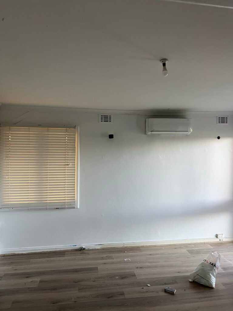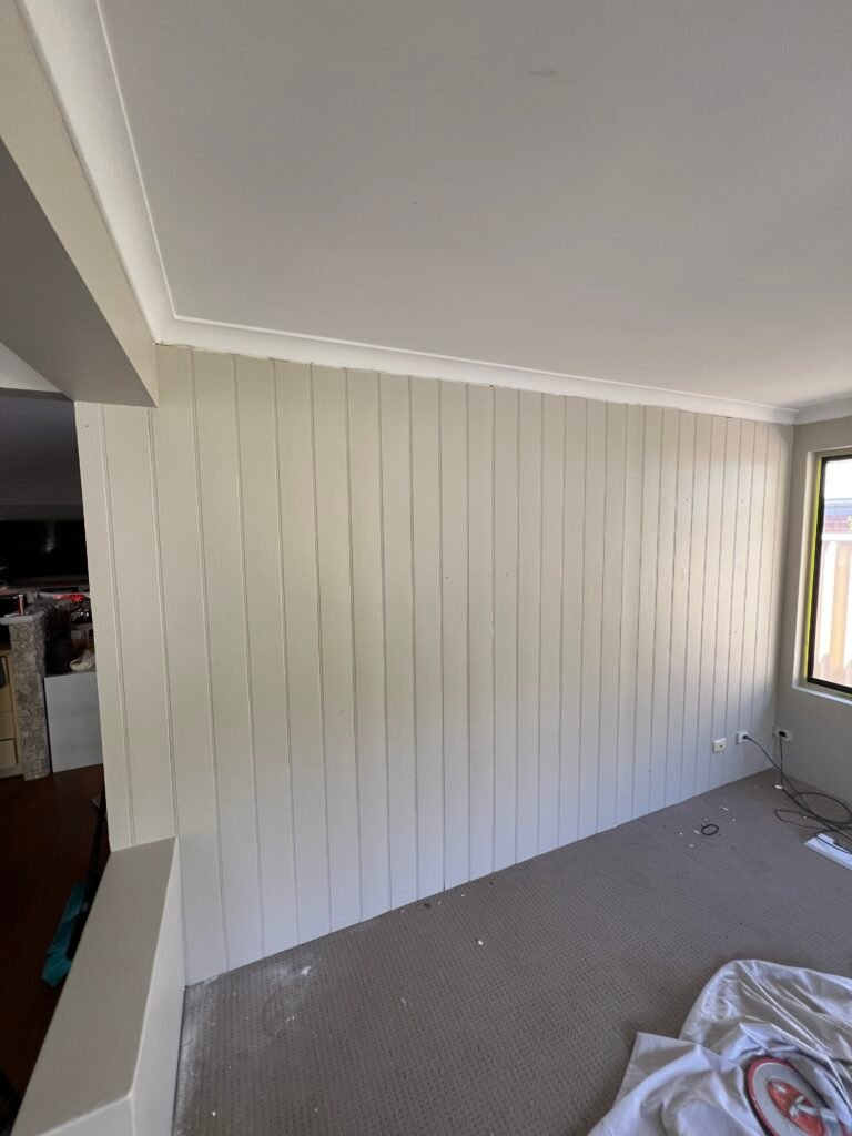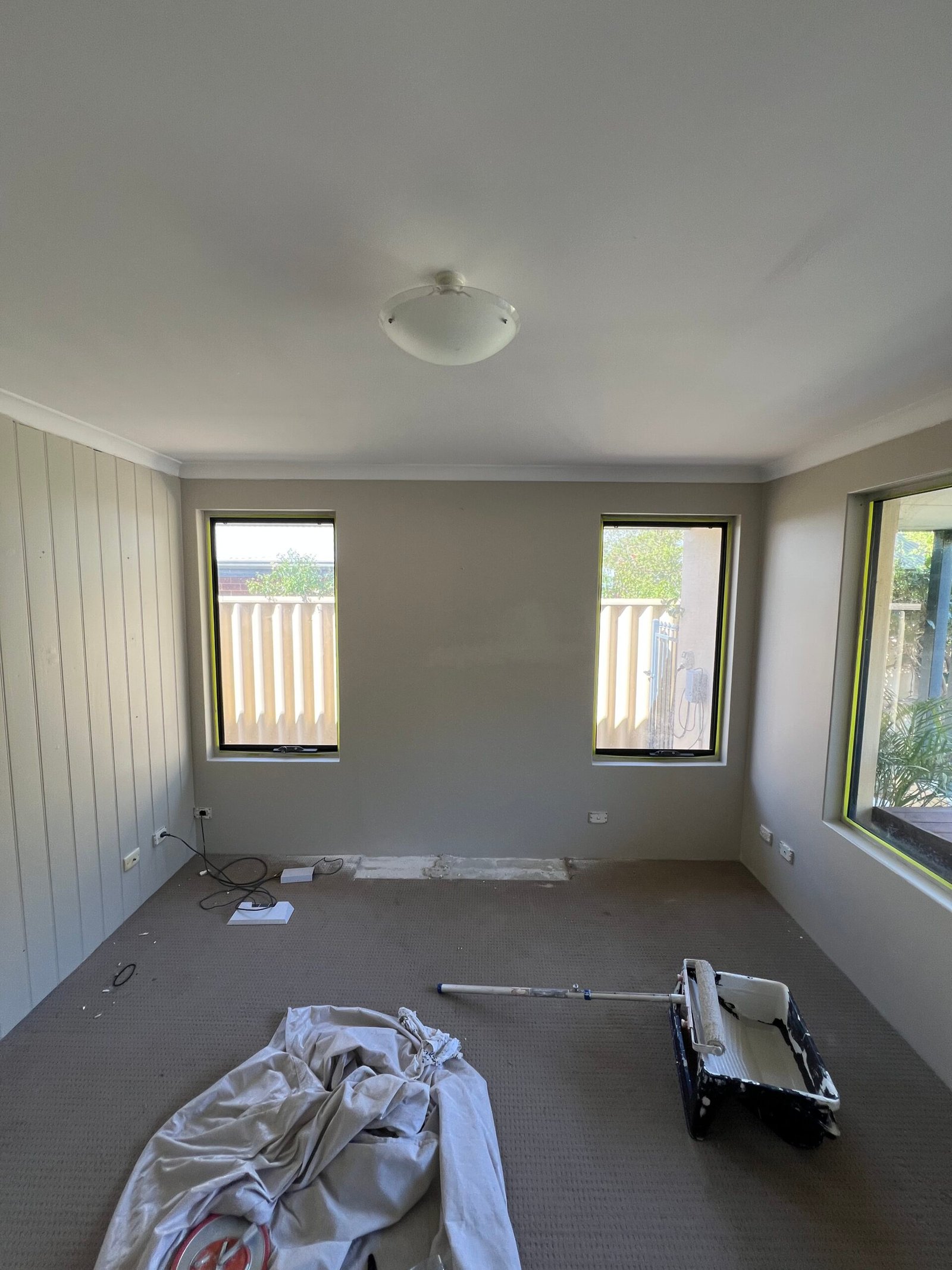
Choosing paint colours can feel overwhelming — there are thousands of shades, and a colour that looks perfect on a swatch can look completely different on your walls. In Perth, our strong, bright light makes that difference even bigger.
Here is a practical, professional approach to choosing interior colours that look great in Perth homes and stay looking good for years.
How Perth Light Changes Colour
Perth gets plenty of clear, intense sunlight. That light can wash colours out, make cool greys look cold and blue, and make bright whites feel glaring. Rooms facing north tend to feel warm and bright, while south-facing rooms get softer, cooler light.
The same paint can look noticeably different from one room to the next, so always judge colours in the room where they will be used.
Why Warm Neutrals Work So Well
Warm neutrals — soft beiges, greige, warm whites and earthy tones — have become a popular choice in Australian homes. They work particularly well in Perth because they:
- Balance strong daylight without looking stark
- Pair easily with timber, stone and natural textures
- Create a calm, inviting feel in living areas and bedrooms
- Date more slowly than bold trend colours
Choosing the Right White
White is never just white. Some whites lean warm (yellow or red undertones), others cool (blue or green undertones). In bright Perth light, a very cool or stark white can feel clinical, while a soft warm white usually feels more relaxed and liveable.
Tip: hold samples against a sheet of plain white paper — the undertone becomes much easier to see.
Bedrooms and Living Areas
Colour influences how a room feels. Softer, muted tones — gentle greens, warm greys and calm blues — suit bedrooms where you want to unwind. Living areas often benefit from warm neutrals that make the space feel open and welcoming, with depth added through a feature wall or darker joinery.
Feature Walls: Do Them Well or Not at All
A feature wall works best when it has a reason to be there — behind a bed, around a fireplace or on a wall with architectural detail. Darker colours need full, even coverage, so expect an extra coat when going dark (or back to light later).
Don’t Forget Sheen
The finish matters as much as the colour:
- Matt or low sheen — hides minor wall imperfections and looks soft and refined on walls
- Semi-gloss or gloss — tougher and easier to wipe, ideal for doors, frames and skirting boards
- Washable finishes — worth it for hallways, kids’ rooms and high-traffic areas
A Simple Process to Choose With Confidence
- Shortlist two or three colours, not twenty.
- Paint large sample patches (or use sample boards) on at least two walls.
- Look at them in the morning, afternoon and under evening lighting.
- Check them next to your floors, benchtops and furniture.
- Choose ceilings and trims to complement — not compete with — the walls.
Get Help From a Professional Painter
Good preparation and application make any colour look better: smooth walls, sharp cut-in lines and full coverage are what make a room feel finished. Explore our interior painting service, browse our recent work, or request a free quote.
Frequently Asked Questions
What colour makes a room look bigger?
Lighter colours and soft warm whites generally make rooms feel larger and brighter, especially with matching or slightly lighter ceilings.
Should ceilings always be white?
Not always. A ceiling tinted slightly to match the walls can feel more cohesive, but a flat white ceiling remains the most popular choice.
How many sample pots should I buy?
Two or three is usually enough. Narrowing your shortlist early makes the decision much easier.